
.avif)

Let's Get to Work
=
INFO@FADETOBLACK.IO
=
LETS Tell Your STORY
=
INFO@FADETOBLACK.IO
=


Josef P is a next-generation Pilates brand redefining accessibility, design, and user experience in the Reformer Pilates space. This branding project covered the development of the overarching identity for the flagship location in Munich’s Schwabing district, including brand strategy, naming, visual language, sub-brand architecture (e.g. JOSEF P Acai), customer experience design, and digital touchpoints. With a minimal, modern, and modular approach, the brand aims to democratize high-quality Pilates training through a hybrid model of instructor-led and screen-based workouts, backed by tech-powered booking and customer management.
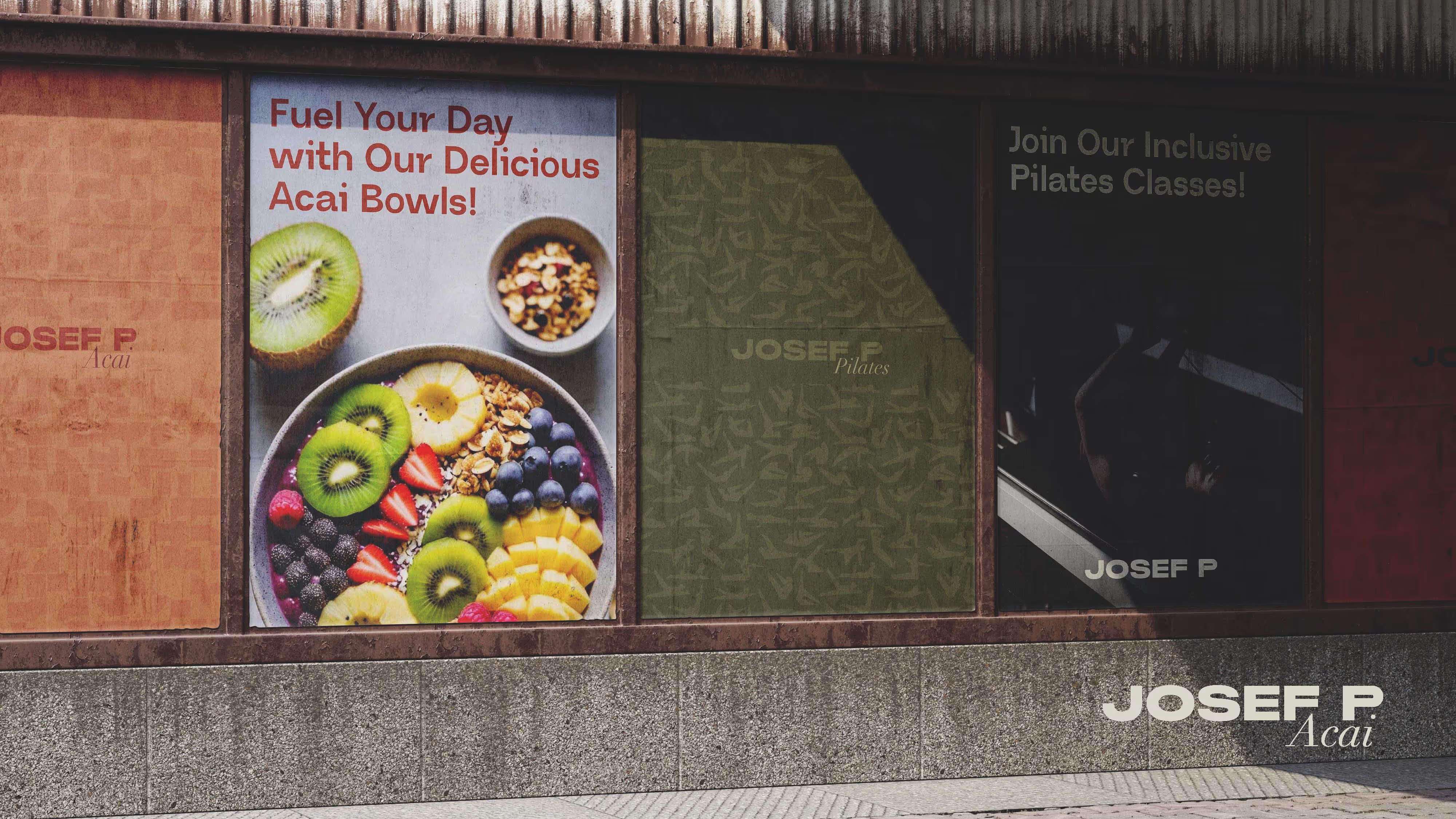
From the beginning, the challenge was to build a flagship studio experience that felt exclusive without being exclusionary. We wanted to communicate elegance and clarity in design while creating a brand that people could identify with not just as a fitness space, but as a lifestyle concept. Our aim was to create something scalable, modular, and distinct in tone free of generic naming conventions (no “studios,” “clubs,” or “houses”) and rooted in purpose: making Pilates truly accessible to all.


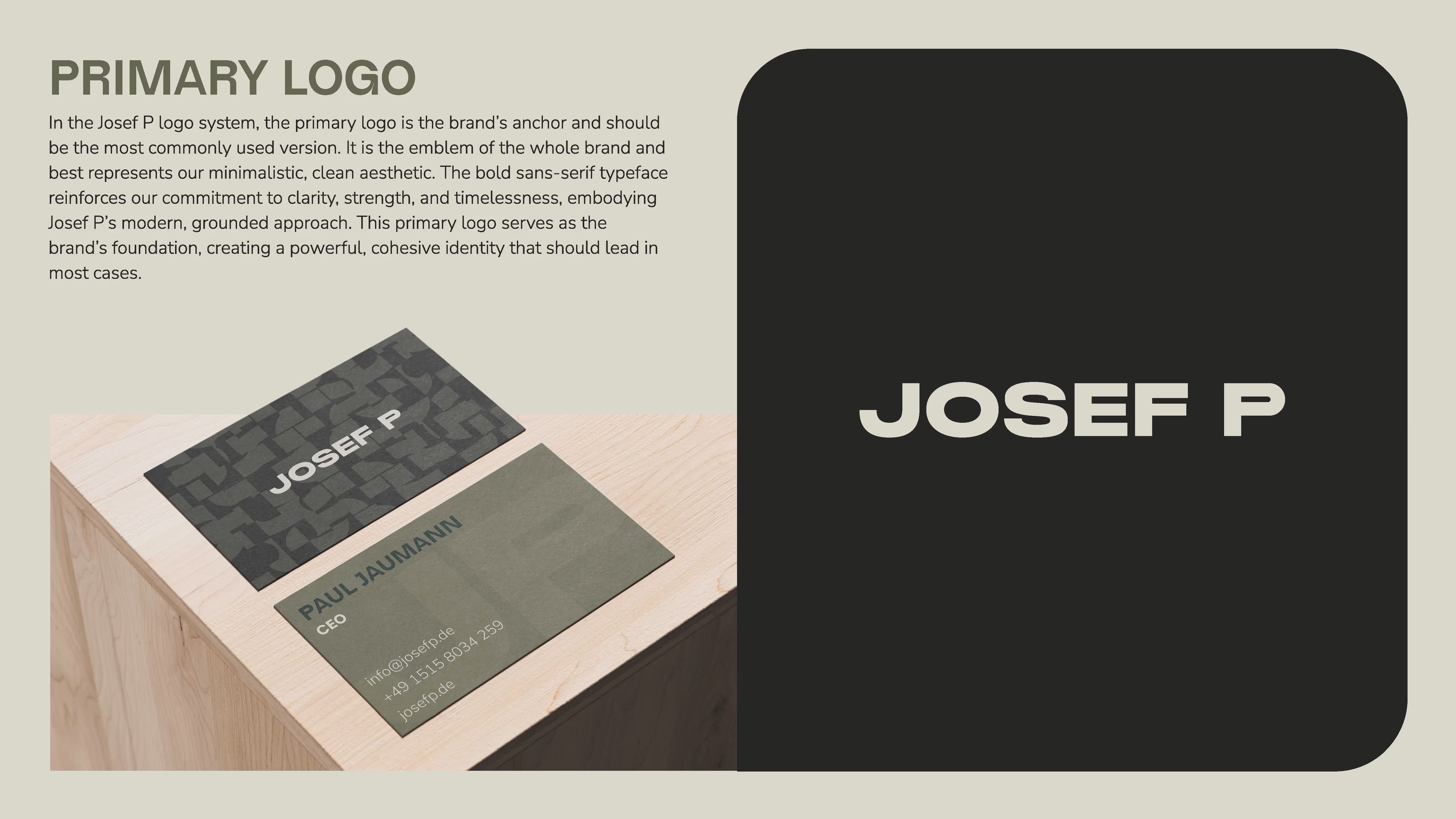
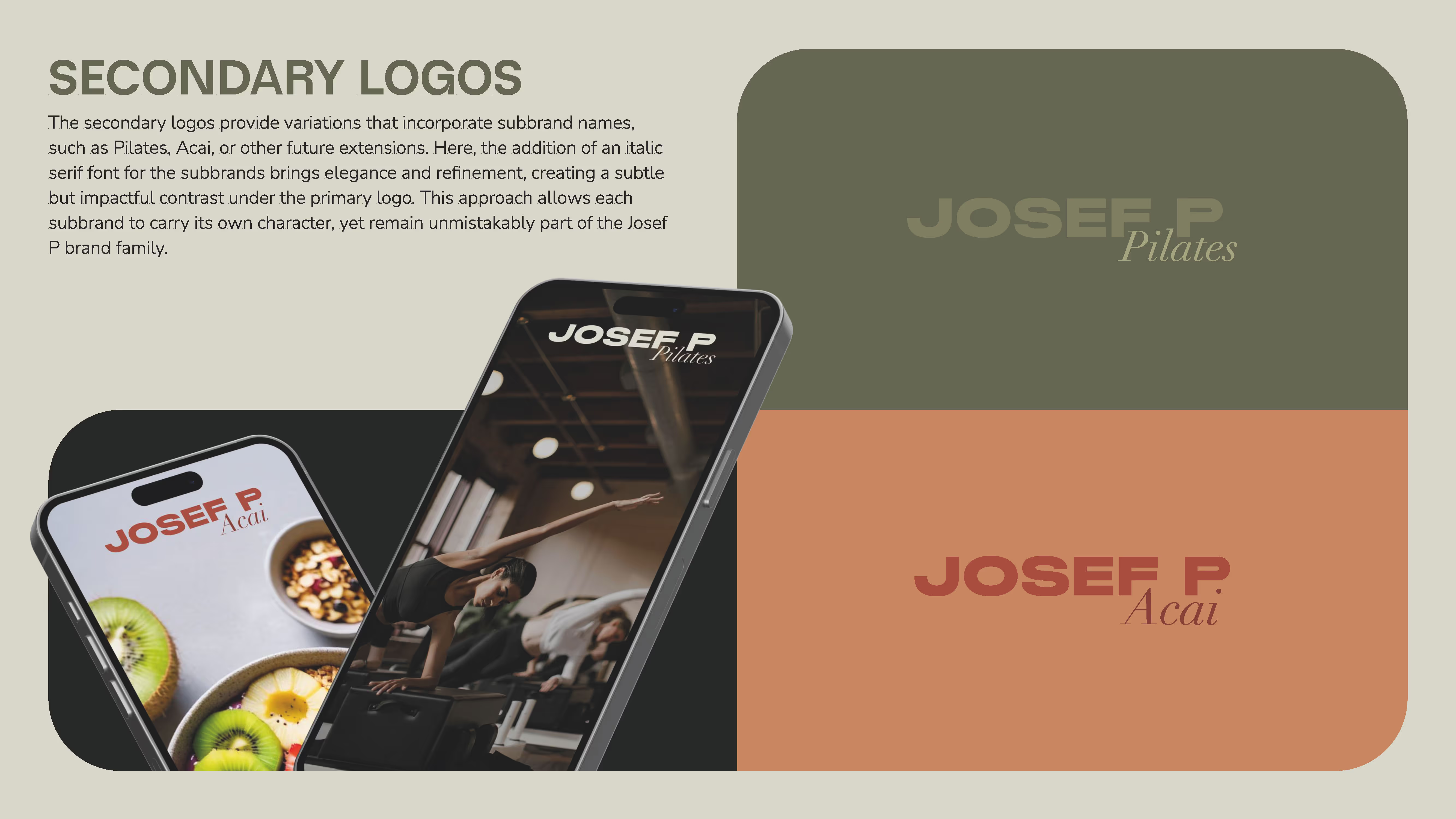
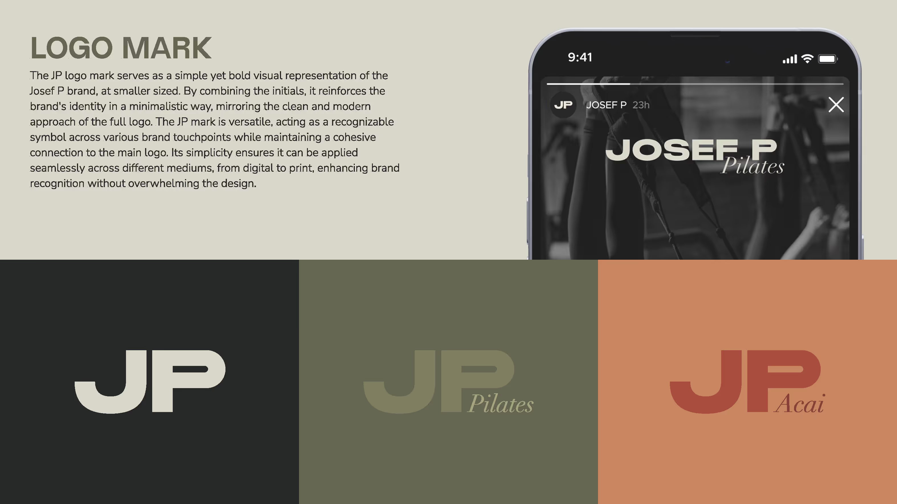
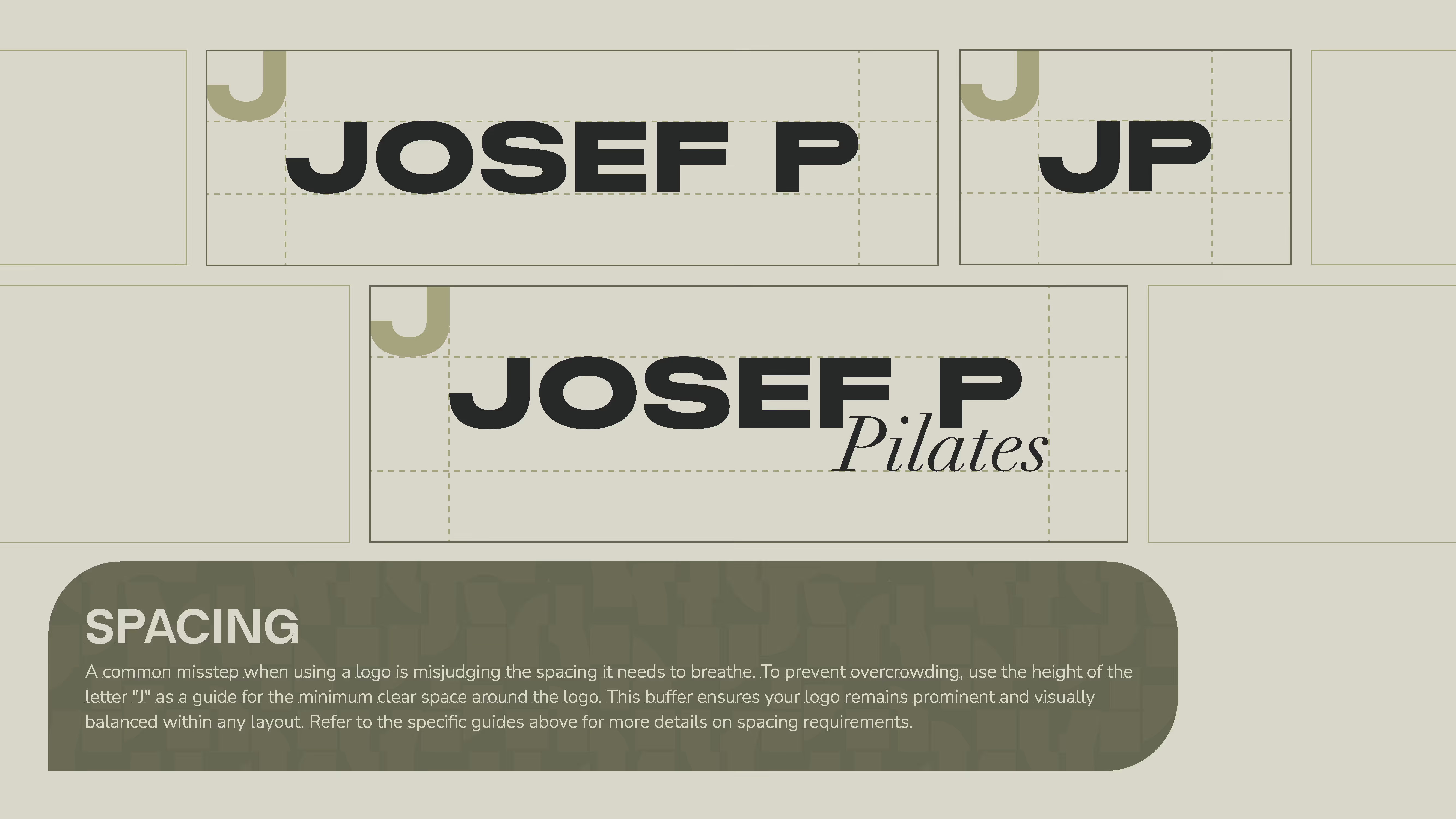
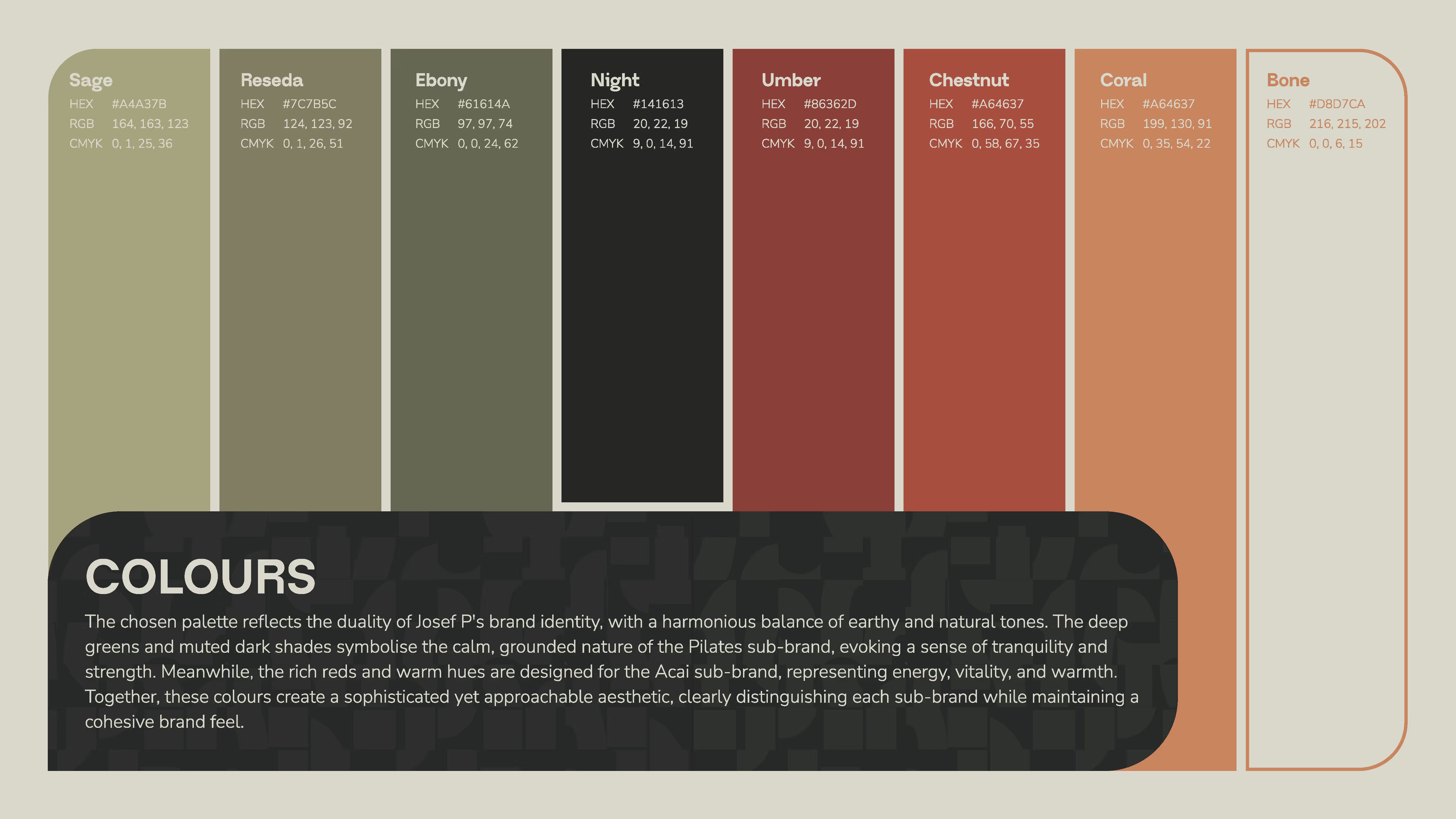
We created a bold, clean typographic logo system for Josef P and its sub-brands. Each brand extension (e.g. Acai, merchandise) has its own color identity while staying cohesive through minimalism and structural alignment. The Josef P wordmark avoids overused design clichés and presents as confident, fresh, and modern.
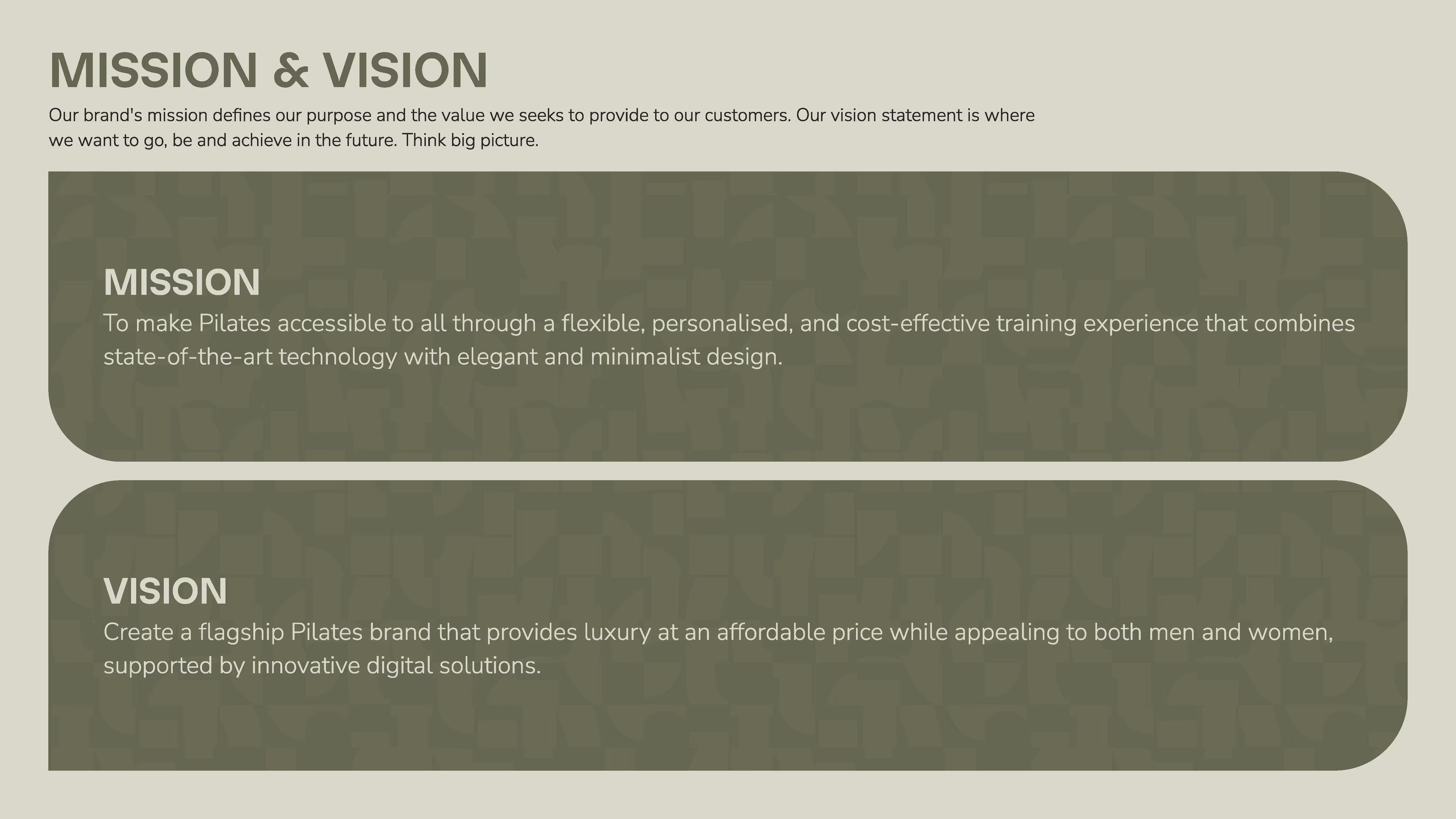
We worked with the team to define the brand’s core mission and values, distilling them into a communicative tone that blends calm mentorship with accessible sportiness. A tailored moodboard informed by brands like ALO Yoga, Jil Sander, and ON Running was translated into the visual language, neutral tones, calming spaces, human warmth.
Every corner of the studio experience was part of the brand logic from modular room separators that enable private training to a reduced design palette of black, white, grey, and light wood that embodies clarity and elegance. The same thinking extended into the signage, wayfinding, and user interface of the booking process.
The JOSEF P ACAI bar was developed as a lifestyle extension of the Josef P ethos. Its role isn’t just nutritional it opens the space to non-members, adds a social layer, and communicates a holistic approach to well-being that goes beyond the classes. The subbrand is visually distinct yet deeply tied to the Josef P identity.

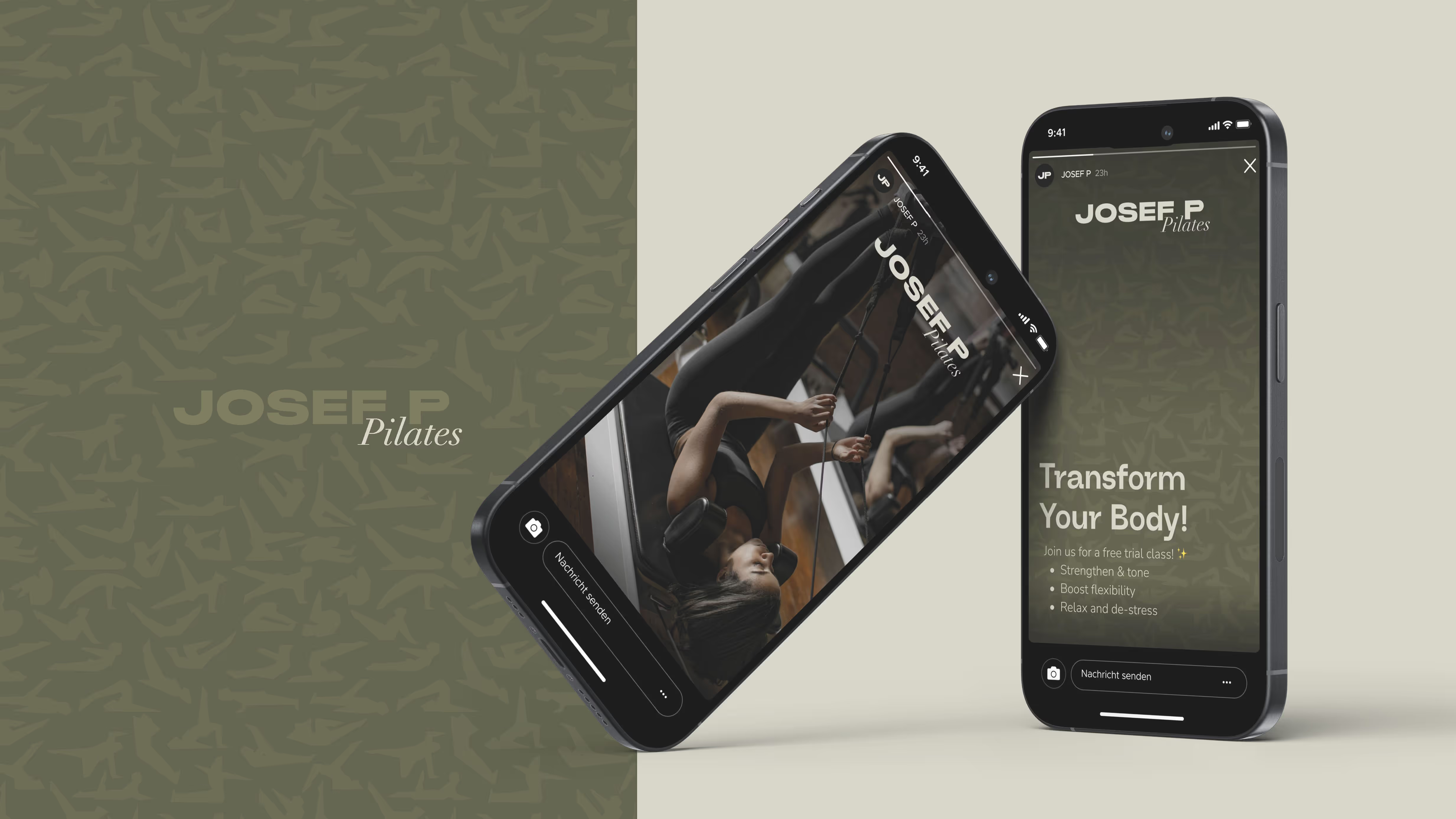
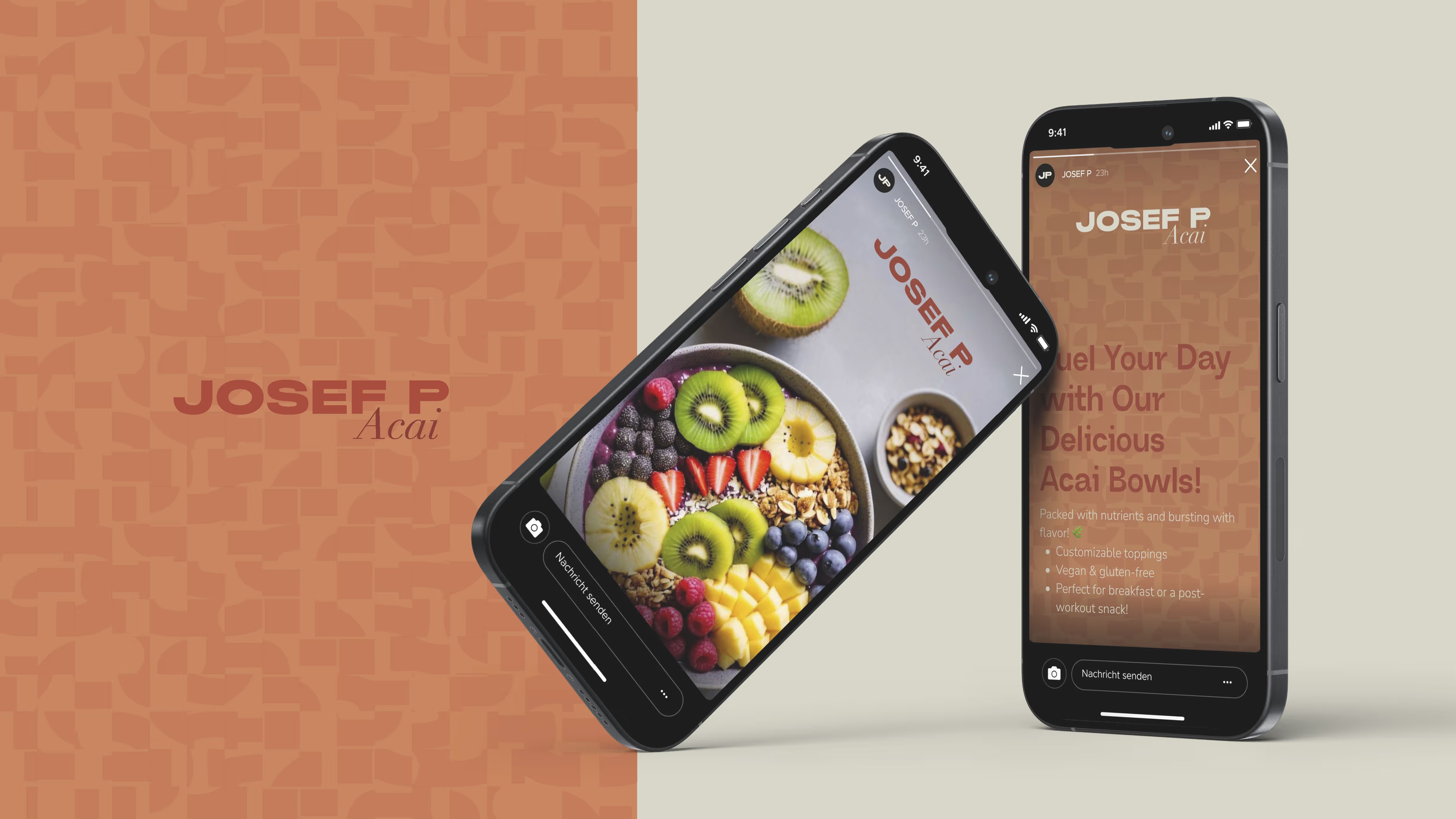
Josef P launched at Tegernsee in April 2025, and grew from a single studio into an international brand within 14 months:
The identity was built to feel larger than its first studio, a lifestyle brand with the JOSEF P Café and its signature açaí bowls as the social anchor of every location. That is what made hotels and premium brands want to co-sign it: the branding carried the expansion.
.avif)